Wednesday, July 27, 2011

Left 4 Dead 2: A hopefully well thought out controller discussion.

Oh hello, I didn't see you there. Don't mind me, I'm just putting on this nice flame-retardant coat and checking on the new aluminum hydroxide wallpaper before I get into the meat of this article. Now you may have noticed that the title of this article has 'Left 4 Dead 2' in it and while that's sort of true the actual discussion of the main issue with that game will be next week while the preamble as it where is what we're here to examine today. But first a few wise words:
“A knife is the most expensive and least effective screwdriver you can buy.”
The above was mentioned to me as a joke at a summer job many years ago at, surprise, a knife store. What it basically means is to use the right tool for the job. Sure you could pound in some nails with the heel of your dress shoes but wouldn't it be easier, faster and safer to use a hammer? This answer is of course 'yes'. And now you're probably confused as to what the hell this has to do with video games. Good question. Well, while not quite as out of place as the pointy screwdriver example above I would argue that standard PS3 Dualshock3 or X-Box 360 controllers with their four face buttons, four shoulder buttons, d-pad and analog sticks are the jack-of-all-trades but master of none of controller options when it comes to certain genres of video games. Those genres would be fighting games and first person shooters where an arcade stick and mouse and keyboard respectively are the generally preferred tools of the trade. I would include racing games (steering wheel) on that list excepting for my complete lack of experience with that genre.
Pictured: A fairly standard arcade stick.

In theory when it comes to fighting games the arcade stick is superior to the controller because most human beings can make faster movements with their wrist than with their fingers. It also helps that the arcade sticks buttons are much larger than the controllers and are usually in a slightly more ergonomic layout. Now I'm well aware of the large number of high level pad warriors in the fighting game community along with the fact that for at least one fighting game (Mortal Kombat) the standard pad is, due to that games mechanics, the go to controller. This is simply meant to be a passing explanation for the reason that the majority go with a specific method of interacting with the medium over another.
Pictured: The authors choice for gaming mice.
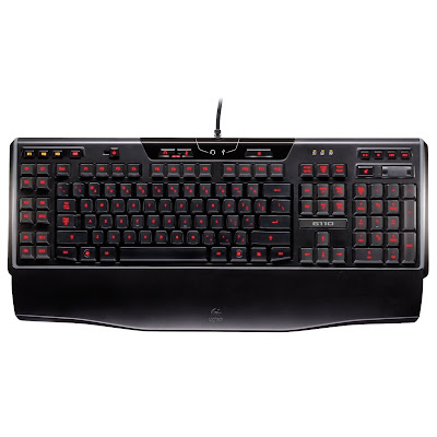
Pictured: A fairly standard gaming keyboard.


In my mind slightly less debatable is the difference between the controller and the mouse and keyboard when it comes to shooters. The ability once again to have the fast movement of your wrist controlling an in game action versus your thumbs is significant when it comes to not getting shot in the back, i.e the camera. Having extra buttons on the mouse is also nice as it means not having to move ones hand to do any number of actions that the developer has decided to map there (zoom-in, weapon/equipment change, melee attacks, etc.) . The extra buttons thing goes for the keyboard as well with the ability to have a lot of macros mapped making the switching of weapons/items, additional movements (jumping or crouching) and interacting with the environment faster and more intuitive. Next week I'll look at the difference between the X-Box 360 and PC version of 'Left 4 Dead 2' and how the difference between the controls results in one very good shooter and one barely average shooter. Until next week I'll leave it up to you to guess which is which.

Wednesday, July 20, 2011

Folklore a.k.a How not to do combat systems

So last week we looked at the...ummm...lackluster storytelling in Folklore. This week we get a lackluster combat system. While I think Folklore might be in the running for the gold medal at the 'Untapped Potential' Olympics the combat is, at least, when compared to the writing merely bland as opposed to outright bad. However drawn out over a long enough time in a game, bland can quickly spiral towards bad as the lack of variety chokes out the few interesting elements that initially had us holding our tongues when it came to critiquing the game.
Pictured:  Get in your damn Pokeball!!!

The first element that goes from “This may be interesting” to “This is starting to irritate me” is the enemy collection aspect of the combat. In short you beat an enemy up and...great, a capture mini-game. Now, it's worth noting that for weaker enemies you simply employ the clunkily implemented PS3 motion controls for a quick capture. For stronger (“stronger” is very relative here) enemies however you must go through a longer and more tedious exercise in motion controls and direction following every time you down one. And for bosses...it's even longer and more tedious. Think 5-10 minutes of beating down the boss then another 2-3 minutes of flailing around with the controller to capture it. I don't mind a long boss fight but what I do mind feeling like I'm being asked to clean up after myself when the fight ends.

Pictured: Living trophy collection.

So at this point it makes sense to actually explain how the combat works. First we start off by assigning up to four different Pokemon...er...folk and then activating them by pressing the corresponding button. That's pretty much it. Sure you can sometimes hold the button to charge up the attack or maybe press the button repeatedly to summon the folk for a series of quick attacks but really it's a pretty straightforward system. Press button attack enemy. So anyhow, you go around the various worlds capturing the different folk in order to what? I'm not really sure actually. I was never able to really differentiate much between the different attacks other than the fact that I quickly concluded that against the standard enemies any attack that required a long charge time was a really bad idea. Sure sometimes you're going to need to find an attack that capitalizes on an enemies weakness but generally you can get by with mashing on fast attacks until you pop the soul, sorry the Id (the red thing in the first picture), out of the enemy and adding them to your Pokedex.
Pictured: A pretty picture.
Now, when I picked up Folklore I wasn't expecting it to set the gaming world on fire. I wasn't expecting some undiscovered gem. I mean I picked the game up last year which for the mathematically challenged among us would be about 3 years after the games initial release. I'm not even sure if I was expecting better than what I got. However after playing the game for a little while I got the notion that since the art was so nice that this must simply be a game that had slipped through the cracks. Playing for a while longer made me realize I was wrong. It's a game with a lot of (unrealized) potential. I wasn't expecting the writing to be the next great American novel but I would have liked it to be a notch above the Sunday comics. I wasn't expecting the combat system to rival 'Devil May Cry' or 'God of War' but having the ability to jump or to combine attacks would have been nice. The longer I played the game the sorrier I felt for the art staff as they where the only ones who really held up their end of the bargain. If you have some time check out the videos on Amazon which highlight the many fantastical design elements that I didn't get to here to get an even better idea of what the games art and world design is further into the game. It's also interesting to note in those same videos the attempts trying (and failing) to make the enemy capture and combat elements seem innovative and exciting. Someday I may finish Folklore but that day is not today and it probably isn't soon. See you all next week.

Wednesday, July 13, 2011

Folklore a.k.a How not to do linear narrative.

Ok, so this week it really is time for something different. However before we get to that I need to throw out a small disclaimer. Even in spite of all the mean things I'm going to say about Folklore it is still a game with an incredibly unique approach to world and character design such that it's still worth checking out on that basis alone. It's just a shame that the combat designers and writers couldn't measure up to the games art staff. Today we're going to be looking at the issues with the games writing (bad) and the presentation (inconsistent and lifeless) of aforementioned writing.
Pictured: Textbook linear gameplay.
Also here's one more disclaimer before we really get going: I never actually finished Folklore. The writing was too bad, the combat too repetitive and the overall story too linear. So while it shares an issue, shown above, with many other linear games in that most conversations with non-player characters (NPCs) are along the lines of go here, get this or vice versa. It exacerbates this issue through the methods it uses to communicate with the player.

Pictured: A character you will probably grow to dislike.
The first is the, thankfully rare, fully animated cinematic. The main reason for this is that the voice acting in this game could charitably be described as lacking and less charitably be described as bad. These are problems that tend to compound one another.
"I only asked you how your day was."
Pictured: It's like they're not even having the same conversation.
The two paper dolls talking to one another is a fairly common storytelling device in Japanese role-playing games (JRPGs). Modern JRPGs have, however, begun to add a voice-over to what is usually a pretty lifeless and non-interactive method of communicating information to the player. Here it's probably a good thing that there isn't a voice-over but that still doesn't make this an ideal way to have the player communicate with NPCs.
Pictured:  A character actually emoting. 
Now here's a genuinely creative and interesting way for the game to talk to the player. A partially animated comic strip. This mode really allows for the games artistic value to shine through while minimizing the impact of the writing (usually). It also allows the viewer to get a good look at the character designs.
Pictured:  The main problem with this game.
Now, at this point you might be thinking: Ok, so it's a badly written game, so what? There are plenty of those out there. Well the simple, seemingly innocuous screen above is what. The two characters don't really participate in different stories. Rather they're experiencing the same story from two different perspectives. You have a couple of choices about how to play this out but it's overall very linear regardless. You might now find yourself drifting back to the thoughts of “So what?”. Well the issue here is that the game enforces a dual playthrough. I was warned by a kindly reviewer on Amazon.com when I bought the game that you can only get so far with one character before you're forced to play catch up with the other one in order to continue with either. What this means is that if you played all the way up to the cutoff point with one character that the story elements of the character you'd been ignoring completely are already spoiled for you. Even going with alternating chapters you're going to find the story mostly spoiled for you when running a given chapter through for a second time. It was because of this forced dual playthrough and the combat (next week) that I decided to move on to other games. Check back next week for the issues with Folklore's combat.


Wednesday, July 6, 2011

Marvel vs. Capcom 3: Fate of Post-Match Time Wasting

And now for something completely diff...alright you got me what we're looking at this week is pretty much a continuation of what we started last week. Only now we're looking at the time wasting that goes on after the match is over. So win or lose the first thing we'll be treated to after the match is a short un-skippable cinematic featuring whichever character was on point for the winning team. It's worth noting that even though these cinematics are a feature of almost every gameplay mode it is only within the online play that the player cannot skip them. Cinematics during story mode are fine. Cinematics during online play are not.  

"Behold my glowing hand!"
 After the cinematic event we're now get a giant comic book-esque splash panel featuring either our team and 'WINNER!!!' or our opponents team and 'YOU LOSE...'. This is wholly unnecessary as I would sincerely hope that the player can figure out whether they won or not without this time waster popping up. With most of the post match stuff 'time wasting' is being defined as something that the user cannot skip and/or something that conveys no useful information. By that definition all of the post-match song and dance is, as currently implemented, a complete waste of time.
Pictured:  w00t, we won!
Pictured:  Awww snap, we lost.
Now finally after all of that junk we're treated the first screen that we can actually cancel out of. A screen which if we where paying attention earlier is full of useless information as we already know ours and our opponents win/loss record (also post-match, such information is, in my opinion, more than a tad pointless). We also get treated to this graphical metric that I'm supposing allegedly represents how well we performed without indicating whether or not we won. Useless.
Pictured: A strange definition of 'Same' skill.
Another thing we should pick up on from this screen if we recall our search settings from the previous article is that the game has a very strange definition of 'Same' with regards to skill. A competitive match is fun. A massacre eh...not so much. This applies, at least to me, irregardless of whether I was the one getting stomped or the one doing the stomping.
Pictured: What are we updating here?
Pictured:  Great, more useless points.  
Pictured:  And now we're saving...again?!?
So after all of that we go back, more or less, to the main online menu only to be greeted by this confusing sequence. First we update our player data, then we get some meaningless points and then we save the game. But wait! Keen observers will notice that a little 'Saving...' icon popped up way back during the end match cinematic.


What was it saving during the cinematic?
Why do I have to acknowledge these meaningless points?
Why couldn't the awarding of points have been integrated into one of the other post-match screens?
Why are we saving again?
What's the difference between 'Updating Player Data' and 'Saving..'?

These are all questions that the game artfully dodges as it forces us to sit through this sequence after every single ranked match. This is not streamlined. It is not even close to being streamlined. In fact it is about as not streamlined as it can get. The ideal post-match flow should be one or two screens, no cinematics and only one item/menu that needs to be manually clicked away. Simple, concise and quick. In other words: not this. Never this. Okay, deep breath. Check back next week for Folklore.